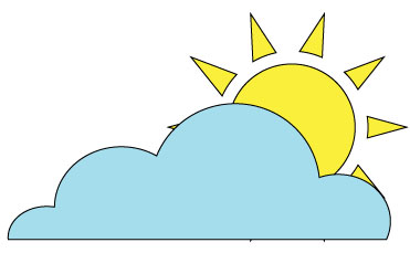
At first when I started the sun and clouds activity. I really struggled with the use of the pen tool. I had a hard time trying to get the right angle to give the clouds shape. Now that I have had some practice with the pen tool , I would go back and make the angles maybe a little more dull to give the cloud a more rounded shape. I may also add some luminosity to maybe give the sun a little bit of a glow. I enjoyed the sun and clouds activity because I think that everyone's looked different depending on your strength with the pen tool. it also gave you the freedom to add details if you knew how. (such as a glow)
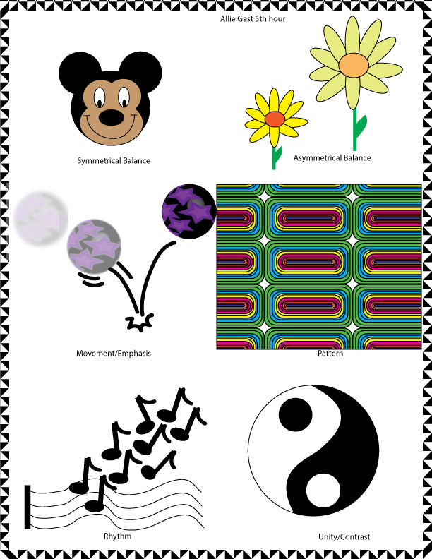
This exercise was somewhat tricky for me. I struggled with ideas of what I would do for each example. I thought that making the pattern was the easiest. If I could go back though I would make the pattern on an object such as a couch or a piece of furniture, not just plainly fill the box with the specific pattern. I also struggled with the movement part of it. I did music notes coming off of a staff, but i don’t really think that this captured the movement portion that we learned how to do. This was also one of the first projects with illustrator and I was just getting used to it.
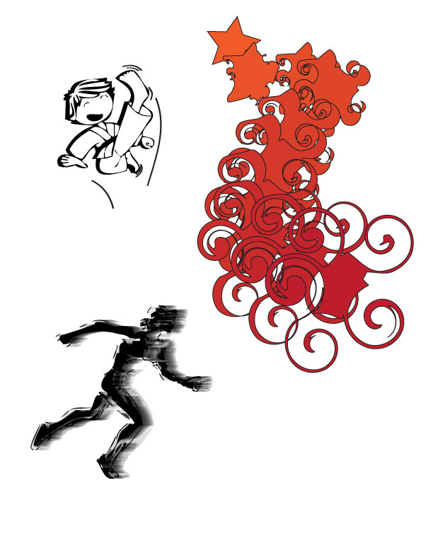
I liked the movement and emphasis exercise. My favorite part about it was making the runner look like they were running. These skills that we learned will definitely come in handy in the future projects that we will do. I hope that I will be able to incorporate the skills with the other skills that I have learned in order to make something look like it is almost real. I still need to practice the movement skills though because it is still something new, but is very fun to mess around with.
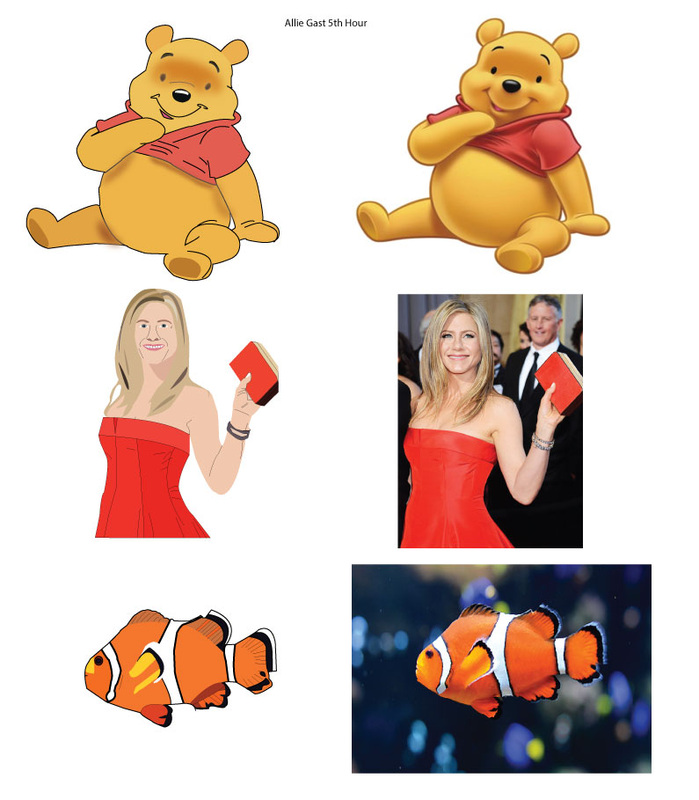
I enjoyed the pen tool project. I thought the hardest part of this was when you traced a celebrity, or a real person. I struggled with trying to make Jennifer Aniston look real. I made a lot of progress with the pen tool and also made progress with the live paint feature. If I were able to go back and change this project, I would make it so the person portion of it had more detail. I would mainly focus on the detail in her face. Also, my animal (fish) looked a little sloppy, so I would go back and re pen tool it, and color it differently with live paint. I enjoyed seeing the end result of the pen tool poster, I thought it turned out better than I thought it would've.
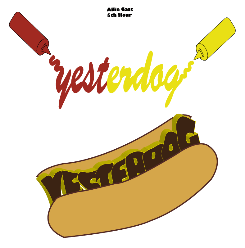
I thought the corporate logo design was a little tricky. I chose my company to be yesterday. This sounded like a great idea at first but struggle with my sketches and was slow on coming to conclusions on my ideas. I ended up liking one of the two that I made better. The first one was a mixture of two types of designs. I used a picture to show something and also used a cool font to portray the picture. I did a ketchup and a mustard bottle squeezing out the word yesterdog. I thought this was creative because it showed the elements that went along with yesterdog. Which is a hot dog place. It was tricky finding a nice font to portray the “squeezing” effect. In the end though, I was happy with the final product.
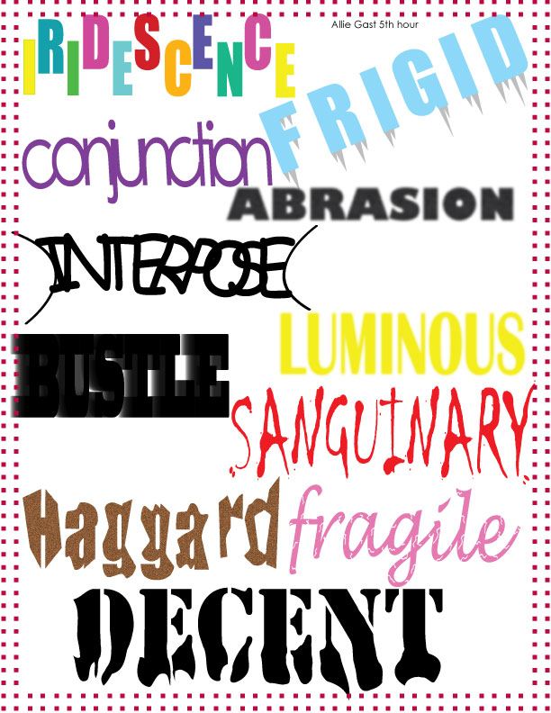
Word Art was a very fun activity. I enjoyed how you had to portray the word with different types of font and patterns. Some were easier than others. My favorite one was frozen. I put it in a big blue font with icicles coming off of it. I thought this was creative because it showed how something could be cold, but it was still saying the word. I did this with the use of the icicles. I struggled with some of the words because I could not come up with creative ideas to show the words. I enjoyed looking at all the different fonts, and learned that a font does a lot more than just make a word look cool. It almost shows what the word means.
